ROLE:
Lead UX/UI Designer
TIMELINE:
3 Months
(March '23 - May '23)
TOOLS:
Figma
Adobe Suite
Miro Board
MY COLLABORATORS:
1 UX Researcher
1 UX/UI Designer
2 Developers
1 Product Manager
2 Climate Data Scientists
CORE RESPONSIBILTIES:
Lead the UX/UI Design of Data Tables & Maps Module, Usability Testing, Visual Design, Interaction design, Design System & Iconography
About IABP
The International Arctic Buoy Programme (IABP) deploys buoys with sensors to collect vital atmospheric data in the Arctic, aiding research on climate patterns and sea ice dynamics.
-
PRIMARY GOAL: Provide an open source information portal that provides real-time Arctic atmospheric data collected by IABP, Buoy specifications, data analysis methodologies, and publications.
-
WHAT IS THE DATA USED FOR?: Research on Arctic climate, weather forecasting, satellite validation, climate modeling, and sample tracking.
-
IMPACT: Over 1000 publications have benefited from observations from the IABP!
Government organizations also use the data to assimilate the strength and trajectory of storms in Alaska.
-
PRIMARY USERS: Climate scientists, researchers, government organizations, and universities.

Buoys being deployed into the Arctic Region by IABP for collecting atmospheric and geospatial data.
OLD DESIGN OF IABP'S WEBSITE
The old website required a redesign to improve the efficiency of finding and downloading relevant information from Data Tables and Geospatial Maps.
A walkthrough of the old website
Understanding the Problem Space
#1: Low Discoverability of Data
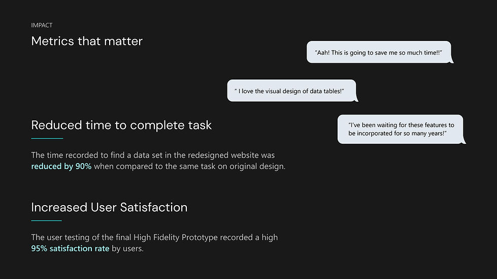
Large amount of data in a tabular format challenged users to view and process information.
More than 70% of users took >10 minutes to find desired buoy data.

#2: Limited Download Options
Users had to download the raw file of each data set individually which was most time-consuming.
#3: Information Overload
The website is filled with text and numbers in the form of tables or paragraph. Users failed to notice important information and CTA’s due to the lack of visual hierarchy.


#4: Static Maps were redundant
The map does not provide any search option to users that makes it impossible to find specific buoy data.
The Challenge
How might we help users to browse, find and analyze relevant data as efficiently as possible?
Business Objectives
The final product successfully combined IABP's business goals with customer goals to give delightful features:
-
Making data accessible and easy to download for new users and returning users.
-
Increasing awareness and exposure for the organization to sustain and advance their work.
-
Enhancing IABP’s visibility among potential investors and their collaborators.
The Solution
Arctic Data Portal
The page was de-cluttered and organized for easy navigation by:
-
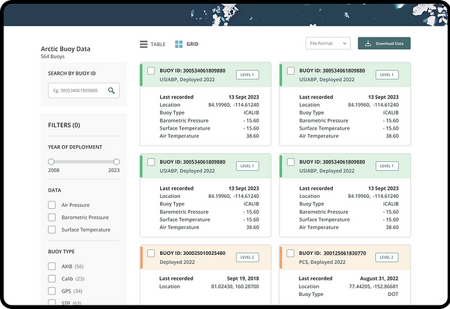
Creating customized filtering and search.
-
Compact Tables with only important information upfront.
-
Multi-select Download.
-
Using colors to indicate Active and Inactive Buoys.

Option to toggle into a Grids for a
holistic view
The feature helped users to view all information together in a visually organized manner.
Adding Map Controls and Interactions
A feature that make sit easy for users to locate buoys on map and download buoys instead of navigating to another page each time.

Want to know how we got there?
Design Process Timeline
March 15
March 30
April 13
April 30
May 14
Research
Design
Handover
to client

A quick scroll through my research process, prioritizing features, and scoping


Understanding the Problem


Ideation


Concept Testing and Design Critique
Received Feedback from 3 current users of the website, Developer & Project Manager, & a Group Critique with the Design Team,

Iterations